Choose product graphic colors that keep the message readable
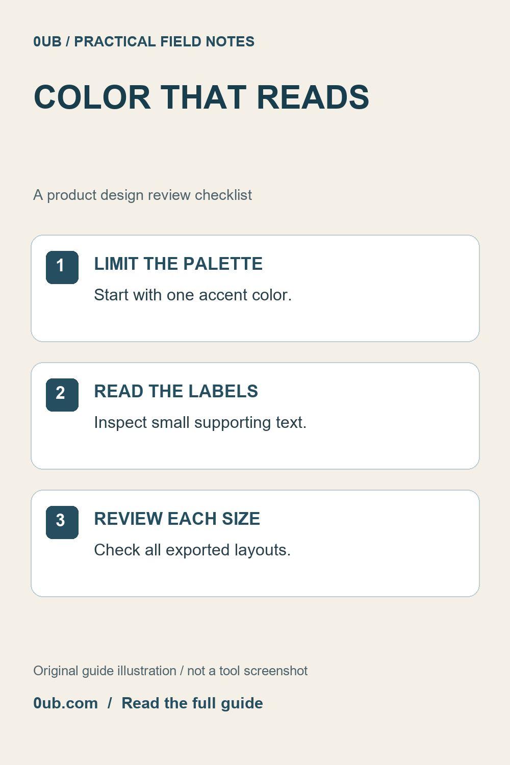
A brand color should support the product message. Compare a restrained palette, inspect small text and review each exported layout before publishing.
Start with a clear content hierarchy
A product graphic has several jobs: identify the item, communicate the main message and tell the reader what to do next. Color helps when it supports that order. If the headline, price, brand and action text all compete for attention, adding another bright color rarely solves the underlying problem.
Begin with a short headline and only the supporting information the reader needs. Confirm the product variant and offer before styling the price. The Product graphics studio creates static visual assets; it does not verify a seller's price or update previously exported graphics when an offer changes.
Use one accent deliberately
Choose a template in Product graphics studio and try a single accent color that works with the product photograph. Keep a restrained starting palette, then compare the preview with a less saturated or darker alternative if small labels are difficult to read. A color that looks attractive as a large swatch may be less useful behind small text.
The accent control affects the template's styling; it is not a separate control for every text element. If the combination still looks unclear, try another existing template or simplify the copy rather than expecting a custom layout editor. Do not treat a visual impression as a measured accessibility certification.
Do not make color carry the whole meaning
Write important distinctions in words as well as through styling. For example, a product option should have a visible name rather than being identified only as the green choice. If a graphic shows an offer, describe the useful condition plainly instead of relying on a colored badge to explain it.
Check the photograph too. A pale product may need a more distinct background, while a very busy image can compete with nearby text. Choose the available photo-fit or crop option deliberately and inspect whether useful product details remain visible. Changing a background or crop should not imply a product feature that the original photograph does not establish.
Review every exported layout
Export one sample and read it at a phone-sized view. Check the headline first, then the smaller brand, supporting text and action line. Inspect the actual downloaded image rather than assuming the editing preview and final viewing context are identical. Enlarge it briefly to catch clipped letters, then return to the ordinary viewing size.
If you export portrait, square and landscape versions, review each one. Different proportions can change text wrapping and the balance between the photo and the message. Finally, check the image in the destination's publishing preview and confirm the associated link leads to the intended product. A tidy palette is useful only when the finished graphic remains understandable where people actually encounter it.
Related guides
- Shorten product headlines before exporting social graphics
- Check the offer before you export a product graphic
Prepared with AI assistance and reviewed against documented tool features; no firsthand testing is implied.